
Graphic Design & Illustration
DESCRIPTION
Always Bit is a clothing brand designed for the fishing and sailing lifestyle. The term "Always Bit" comes from the fact that the fisherman is "always bit" when unhooking the catch of the day.
The client wanted a logo that could be printed on various products, as well as some t-shirt designs/illustrations. As an advocate of hand drawn designs, the client wanted to have a range of both digitally drawn designs and traditional illustrations.
ROLE
Design, Illustration, Brand Development
CREDITS
Pat Beal - Copy & Art Direction

ALWAYS BIT LOGO
The client wanted the A and B of "Always Bit" to be the stand out feature of the logo. They also wanted it to look like it was quickly sketched out, similar to the original Rusty Surf branding. I designed a hand drawn text style that subtly resembled fish bones, then tied both of the letters together with a stylized fish hook.
For the font, I choose a sans-serif font with sharp edges to invoke sharp teeth like that of a shark.


SHIRT DESIGNS
The client wanted a variety of digitally drawn and hand painted illustrations that could be printed on t-shirts to help promote the brand. All shirts would include a left chest imprint of the logo, and full back imprint.
The "Jaws" design is a digitally drawn illustration that was exported as a 1-color design for the screen print process.

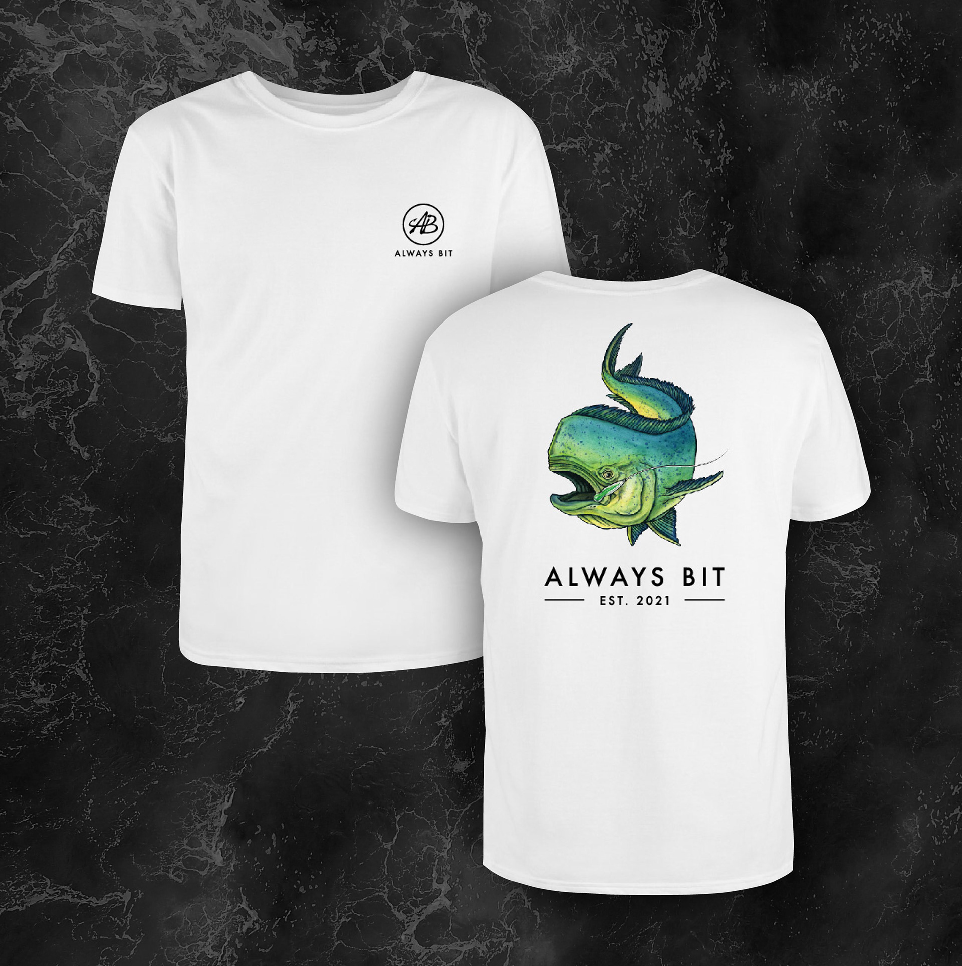
BULL DORADO DESIGN
The Bull Dorado is a male Mahi-Mahi that is highly sought after by fisherman for their beauty, size, and food quality.
The client wanted a compelling, traditionally painted representation of the fish being reeled in. It needed to invoke a sense of admiration, since they are often a difficult catch.
The fish was painted in watercolor, scanned, then digitally enhanced so it could be printed using the dye-sublimation process.
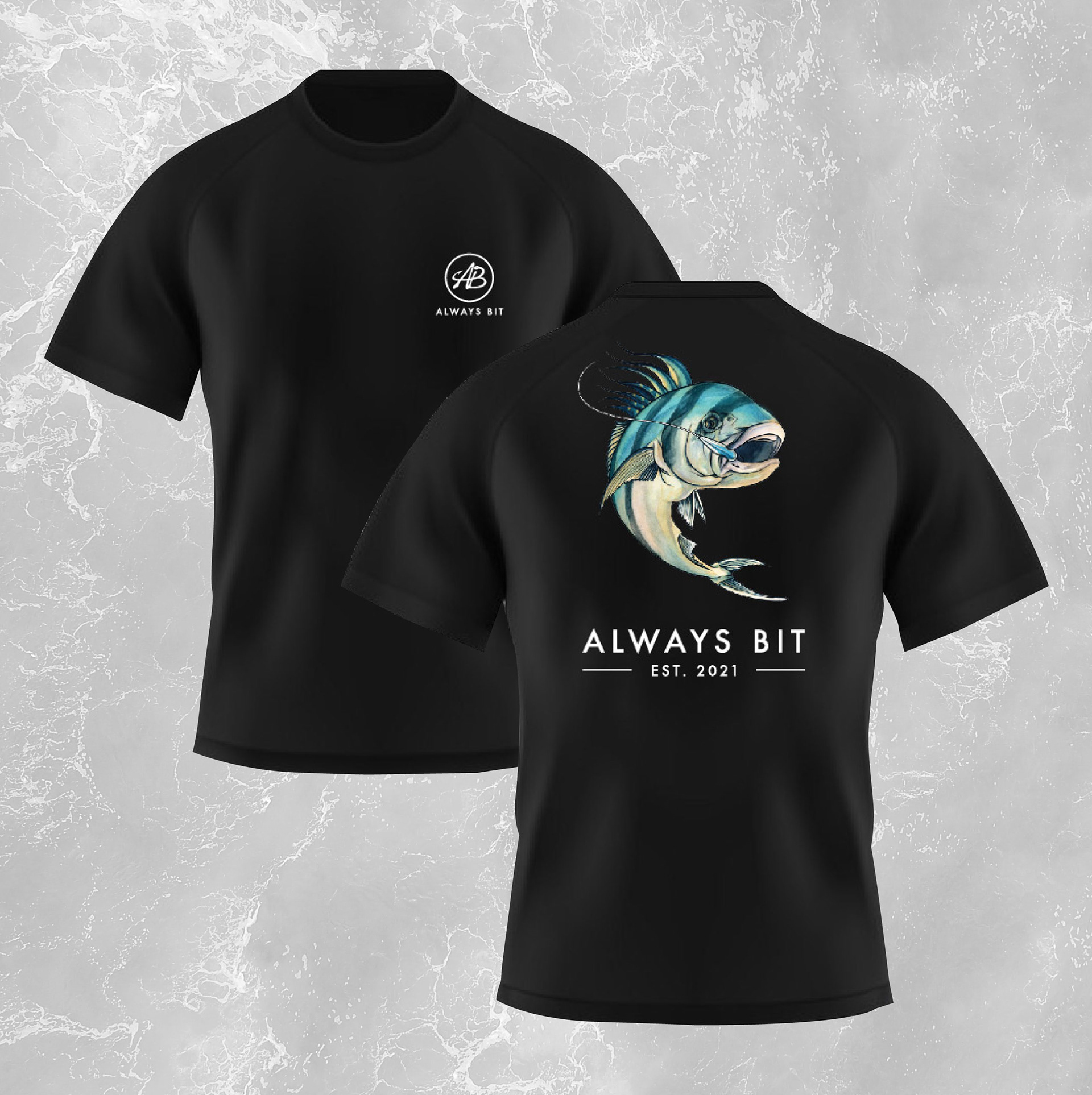
ROOSTERFISH DESIGN
The Roosterfish is a unique species found in the Pacific Ocean that are a popular sport fish for being strong fighters.
The client wanted a compelling, traditionally painted representation of the fish being reeled in. The unique coloring and pattern of the fish needed to be properly displayed.
The fish was painted in watercolor, scanned, then digitally enhanced so it could be printed using the dye-sublimation process.
KITE FISHING DESIGN
Kite fishing is a fishing technique that involves a kite from which a drop line hangs, attached to a lure or bait.
The client wanted a simple illustration showing the kite fishing process. I designed a three quarter, overhead view of a boat on the ocean, heading away from the viewer. This way the kite (with the Always Bit logo) would be the principal feature.
This was digitally drawn, and exported as a 6-color design for the screen print process.


PATCHES
We experimented with some simple patch designs as another product offer. The design was to be kept minimal since it would be embroidered on relatively small patches.
The client wanted one of the designs to display the city of Huntington Beach (where the company is located). We decided to create two different patches; one that had the logo as the focus, and the other to have the name and city as the focus.

CONCEPT DESIGN
As part of the brainstorming process, I would design multiple options that could be printed on a variety of products. The client and I would then meet and discuss what works and what doesn't. It was a great way to evolve the brand.
For these, I created digital outlines of both the Bull Dorado and Roosterfish paintings. I could then easily repurpose them into different designs to see what was possible.
